saz & co is a personal brand built as a quiet tribute to legacy, memory, and intention. Created for a multidisciplinary creative working across social media, influencer marketing, and content strategy, the brand exists at the intersection of aesthetic clarity and emotional depth. The name itself is an amalgamation of initials tied to people deeply loved most notably the client’s late grandfather and sister.
This project was designed as an ode to love that endures, to grief transformed into purpose, and to creativity shaped by those who came before.
For Headings: Nimbus Roman
Body Text:
Glacial Indifference
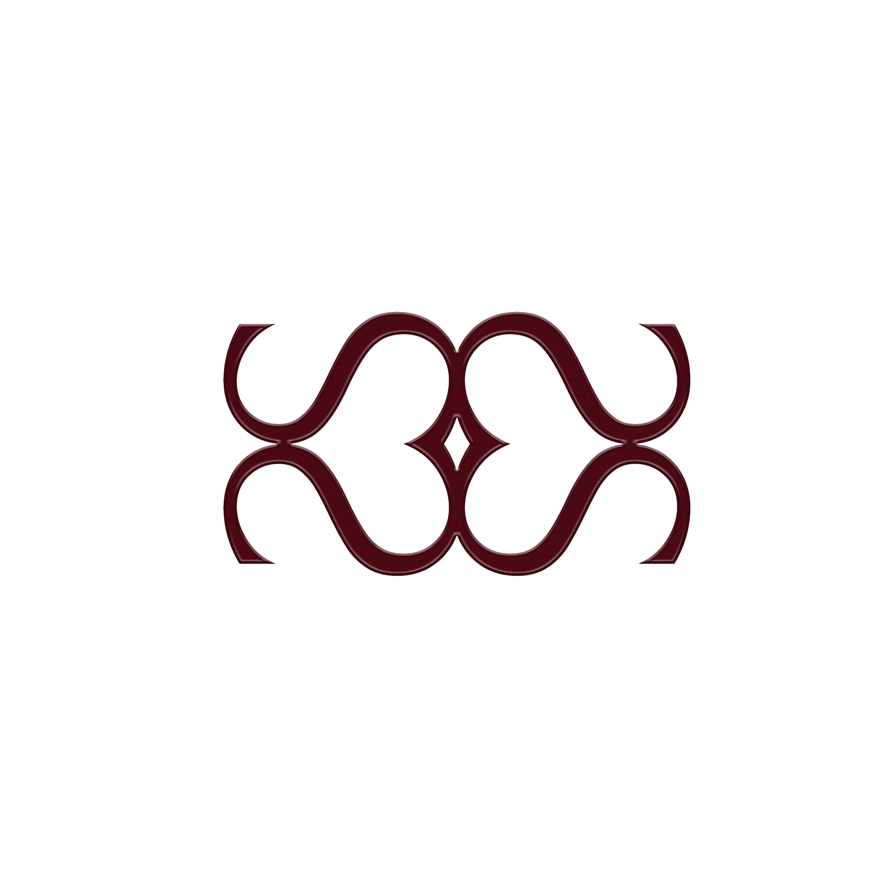
The logomark is designed using the letter “S”, the foundation of the name saz. When the S overlap and mirror one another (intertwine), a continuous loop begins to appear. All the forms meet at the single central point. This core represents the place from which everything connects and flows outward. A subtle reference or hint at infinity - not in an obvious way, but in a felt way.
The softness you see also allows the mark to read almost like a heart, reflecting connection and care values at the core of saz.
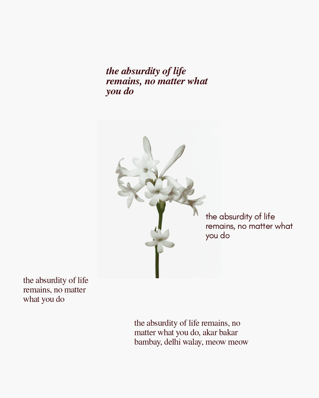
The tuberose, Client’s sister’s favourite flower, became a central emotional reference chosen not for ornamentation, but for what it represents: purity, memory, and a presence that lingers long after. Thus, a part of saz & co.
It came together slowly, the way most things worth keeping do.
saz wasn't built all at once.
They're designed to hold images or text, giving the client something that feels special every time she uses it.
Fancy a Glimpse into the Process ?
Those hand drawn, a little imperfect elements are paired with more structured ones, like the checkered pattern. The contrast between the two is where the system gets its rhythm.